
On Coin Dozer Adventures, I helped adapt Game Circus’ flagship mobile game, Coin Dozer, to a Live-Ops market. We reached the same “social casino” audience as Piggy Go, Coin Master, and Dice Dreams. But our product stood out with unique coin-pusher gameplay and an Indiana Jones style narrative. This page shares my UI contributions to the project.
General Flow
For context, here’s a summary of the screens I worked on and how they affect the core gameplay loop.

Coin Pusher

Original
Update

This was an update to the Coin Pusher UI, following a request to make the background as bright and sunny as our competitors’ games. With a bright background, the UI did not stand out well. My update maintained a clean read by simplifying the render style and increasing contrast within the UI space.
This pass also addressed some points of confusion found during playtests. I replaced the central button with the word “AIM,” to ensure that players know it’s possible to aim coins. And I added a button in the lower-right corner so that players can navigate to the ‘Adventure’ screen more easily.
Finally, there were some minor adjustments: I put the two attack currencies (stars and shields) together and presented them in a consistent style. The scale, font, and color of the bet multiplier (x5) were adjusted to stand out more.
Adventure

In Coin Dozer Adventures, the ‘Adventure’ screen gives the player something to spend their coins on. Most “social casino” games will have the player buy buildings in a small town. But we innovated to better suit our Indiana Jones treasure hunter narrative. Instead of buying a building, you spend coins to move your avatar to the next star in a temple, dodge traps, find hidden rewards, and collect the treasure chest at the end! I was responsible for visual treatment of the UI, the layout of each level, figuring out the moment-to-moment story, designing the backgrounds, and directing junior artists as they worked on the lower priority levels.

These are special nodes that I created to add gameplay variety to the ‘Adventure’ screen. We found that player choice in the metagame was very important to our players. In other titles, players get that by choosing which building to upgrade first. But we added a “Choice Node,” where the player gets to choose one of 2 different rewards: soft currency, energy, etc. Because these rewards impacted gameplay, we felt they gave a sense of strategy in the choice. We also added Story Nodes to get to know the game’s characters, and a random chance Item Node to push a casino feel.
Map
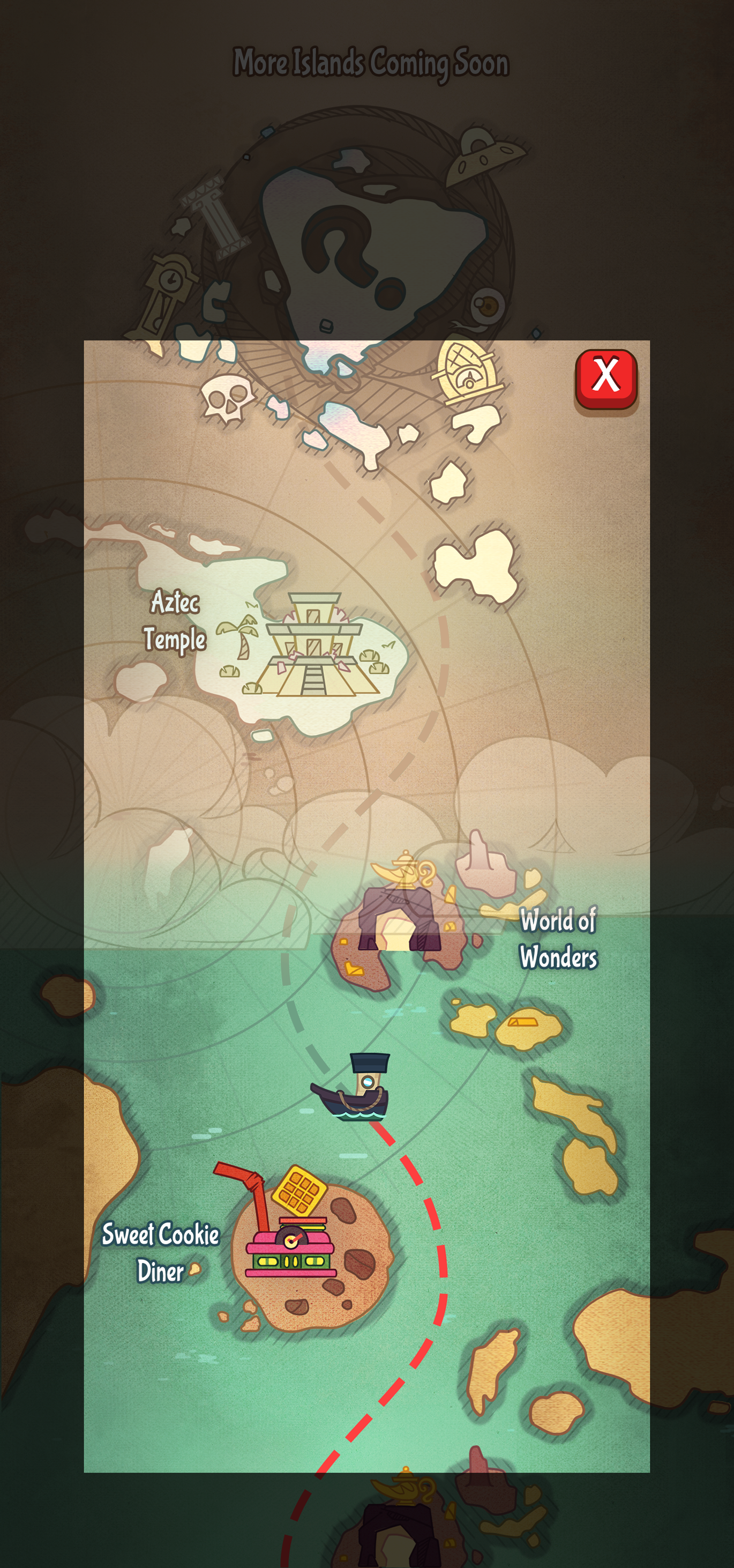
I decided to show the player’s progress with a classic treasure map. It matches the treasure hunting story, implying that you’re traveling through an uncharted archipelago. The hand drawn islands are much easier to produce than more traditional icons. The map starts out in desaturated beige tones, as shown in the top half. And, as the player completes each level, the map is slowly revealed in full color.

All islands in the game follow the layout below. Islands can be placed in the green, but cannot be placed in the red. I set the layout up this way so that the map always feels organic: like the player is weaving around uncharted waters and not just traveling on a straight linear path. It works for any level order the design team may need.
Menu and Popups
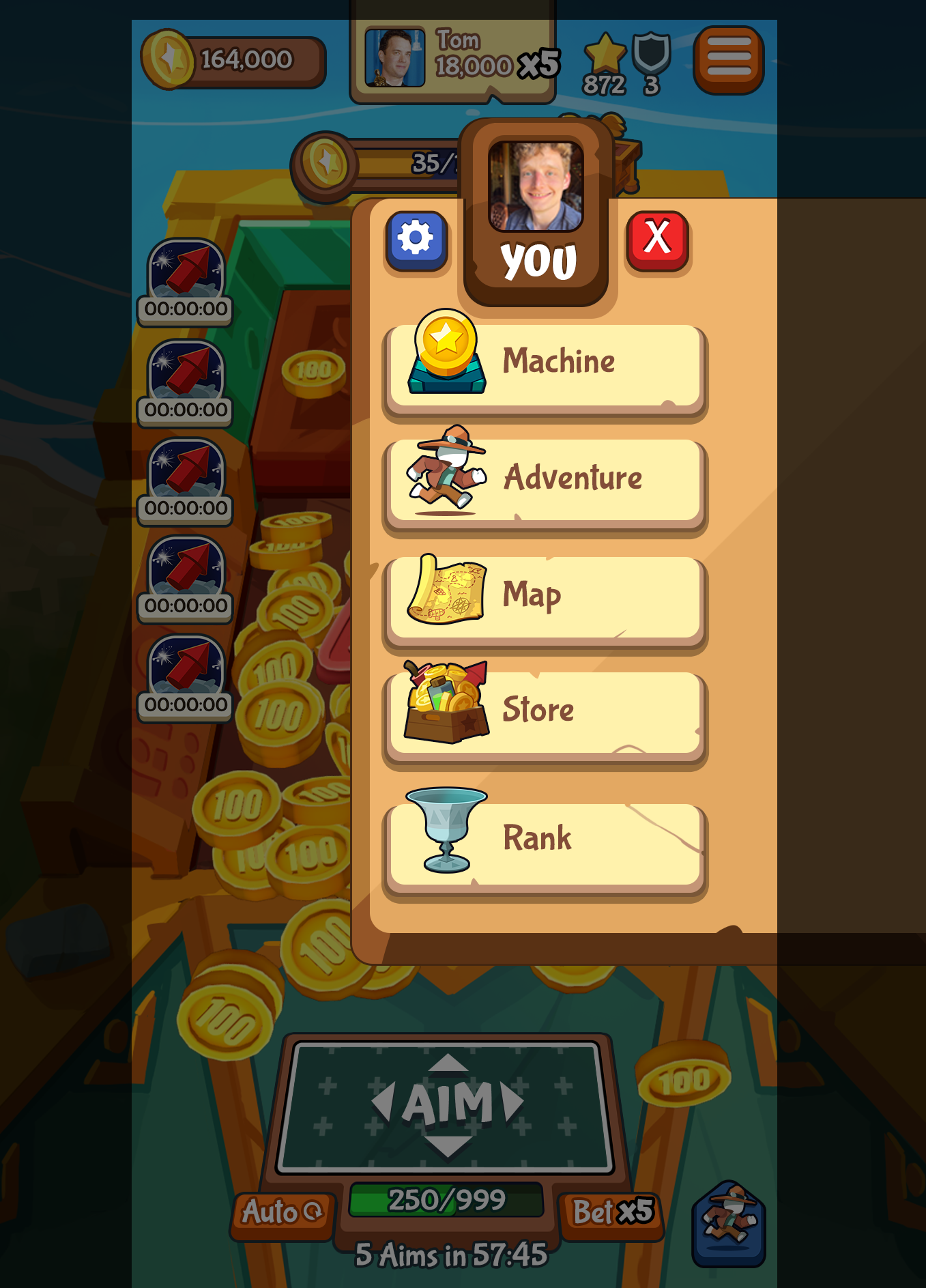
The main menu for the game. Coin Dozer Adventures has several features where your Facebook friends’ portraits are displayed. I added the player’s own Facebook portrait to the top of the menu, thus clarifying that these buttons link to your own information, and not someone else’s. Seeing yourself in the game also makes the social features more impactful.
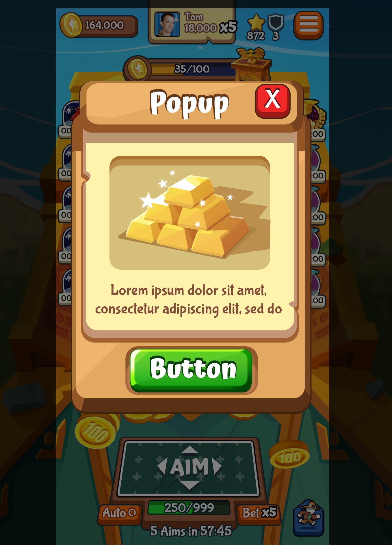
A generic popup used in a variety of placements, such as ‘Not Enough Currency’. As with the ‘Pusher’ screen, I wanted a simple yet high contrast look for readability.